30 january 2025, Emily Van Driessen
When Forms Go Pop: Camila Oliveira Fairclough at Ellen de Bruijne Projects
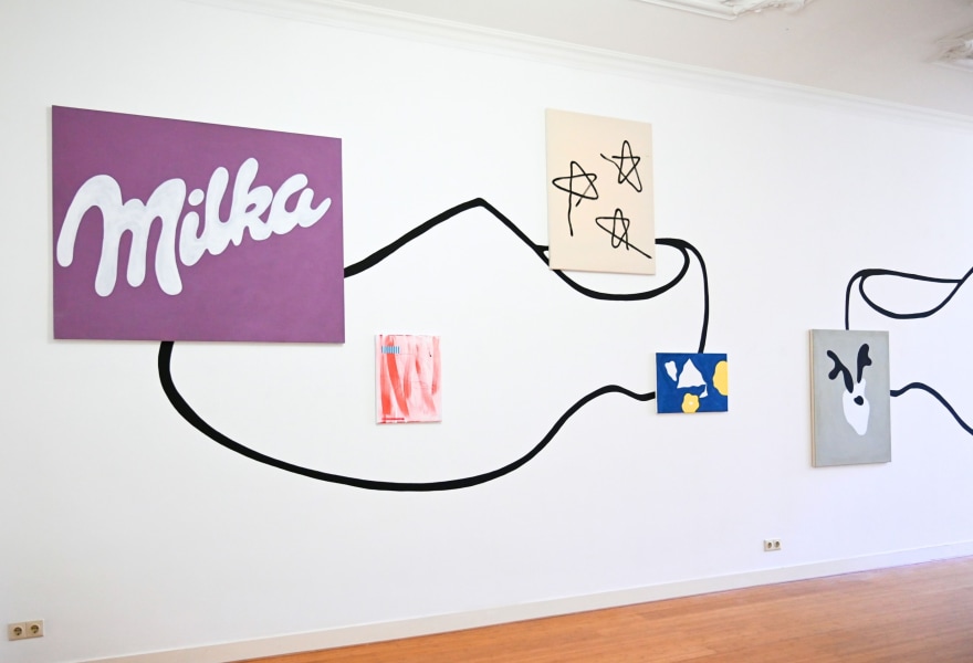
In her first solo exhibition at Ellen de Bruijne Projects in Amsterdam, Camila Oliveira Fairclough (Rio de Janeiro, 1979) brings a world of shapes, language, and artistic references to life. Her work is liberated and playful, rooted in art history and blending with everyday visual culture. Camila’s practice thrives on the simple attraction and the ambiguity of forms, where a Milka chocolate bar can resonate as strongly as a Jean Arp sculpture.
Living Through Forms
“I am very intrigued by simple shapes that people recognise immediately from everyday life,” Camila shares. She has a particular fascination for rounded forms; whether found in nature, architecture, or even packaging. Having grown up in Rio de Janeiro, she recalls the black-and-white wave patterns of the sidewalks near the beach, designed by Oscar Niemeyer. These flowing shapes continue to influence her compositions today.
Camila rejects the strict divide between abstraction and figuration. “When you create something abstract, you will always see a stain, recognise a trace, see something. The rupture between abstraction and figuration does not interest me at all.” Instead, her work emphasises the act of stripping an image of its context and meaning, allowing her to focus solely on the forms that intrigue her. She then translates them into direct and honest paintings.

Camila Oliveira Fairclough, Calendrier du coeur abstrait (after Arp), 2024, Ellen de Bruijne Projects
The Influence of Jean Arp
One of her significant artistic influences in the exhibition is Jean Arp, the Dadaist sculptor and poet. “Arp never made paintings; his works were sculptures, posters, and volumes, and I found it interesting to imagine them as paintings,” she says. She describes her approach as a reinterpretation rather than a direct homage, embracing the freedom that Arp’s biomorphic forms allow. At the same time, as a woman artist and painter, she enjoys appropriating works by male artists and making them her own.
Dada, with its rejection of logic and its embrace of nonsense and poetic play, resonates deeply with Camila’s artistic philosophy. Just as Arp’s work often straddled the border between poetry and sculpture, Camila’s paintings explore a similarly open and playful visual language.
Loving Language and Typography
Language also plays a crucial role in Camila’s practice. Having lived in different linguistic environments - born in Rio, raised in South Africa, later moving to France - she has always been conscious of the ambiguity of words. “When you’re in a foreign country and see a word on packaging, you can often guess whether it’s a type of crisps or champagne. The combination of letters and their shape creates meaning.”
This sensitivity to text extends to her paintings, where she gives each work a name as if it were a person. “Also, typography itself has personality. One is more lyrical, the other more formal. For example, Arial or Times New Roman, they already have a character. I like that fonts are named like people, like a pet, or a caramel.” In this way, Camila blends the physicality of painting with the intimacy of naming, turning each piece into an entity with its own identity.
Live, Love, Laugh, Ellen de Bruijne Projects
The Influence of Walter Swennen and Marcel Broodthaers
Camila also draws inspiration from Walter Swennen, whose playful yet conceptual approach to painting resonates with her. “Swennen once said, ‘Freedom does not exist,’ but to me, he is one of the freest artists.” This sense of freedom, embracing constraints while playing within them, mirrors her own artistic approach.
She also shares a deep appreciation for Marcel Broodthaers, particularly his poetic engagement with language and his experiments with the interplay between text and image.
Laughing at Hierarchies – Pop, Kitsch and Art
“For me, there is no hierarchy between forms,” Camila states. “A cow from a Jean Arp sculpture can hang next to painting of purple-and-white Milka packaging without contradiction.” For her, both shapes are part of the same kind of visual language we encounter daily.
This playful disregard for hierarchy extends to cultural codes. The title of her exhibition, 'Live Love Laugh', references the kitschy decor often found in discount stores. “I wanted something lively, direct, even a little comical. You see these words all the time on cheap decorative frames. It’s a bit kitsch, but I find that amusing.”
This ironic contrast between art history and mass-produced decoration finds another echo in the exhibition poster, which features a traditional Dutch farmer pulling a cow, a nod to Dutch clichés of windmills, milk, and rural life. “I like playing with cultures and their codes,” she explains. Camila does not seek to mock these elements; instead, she transforms them into building blocks for her visual language.

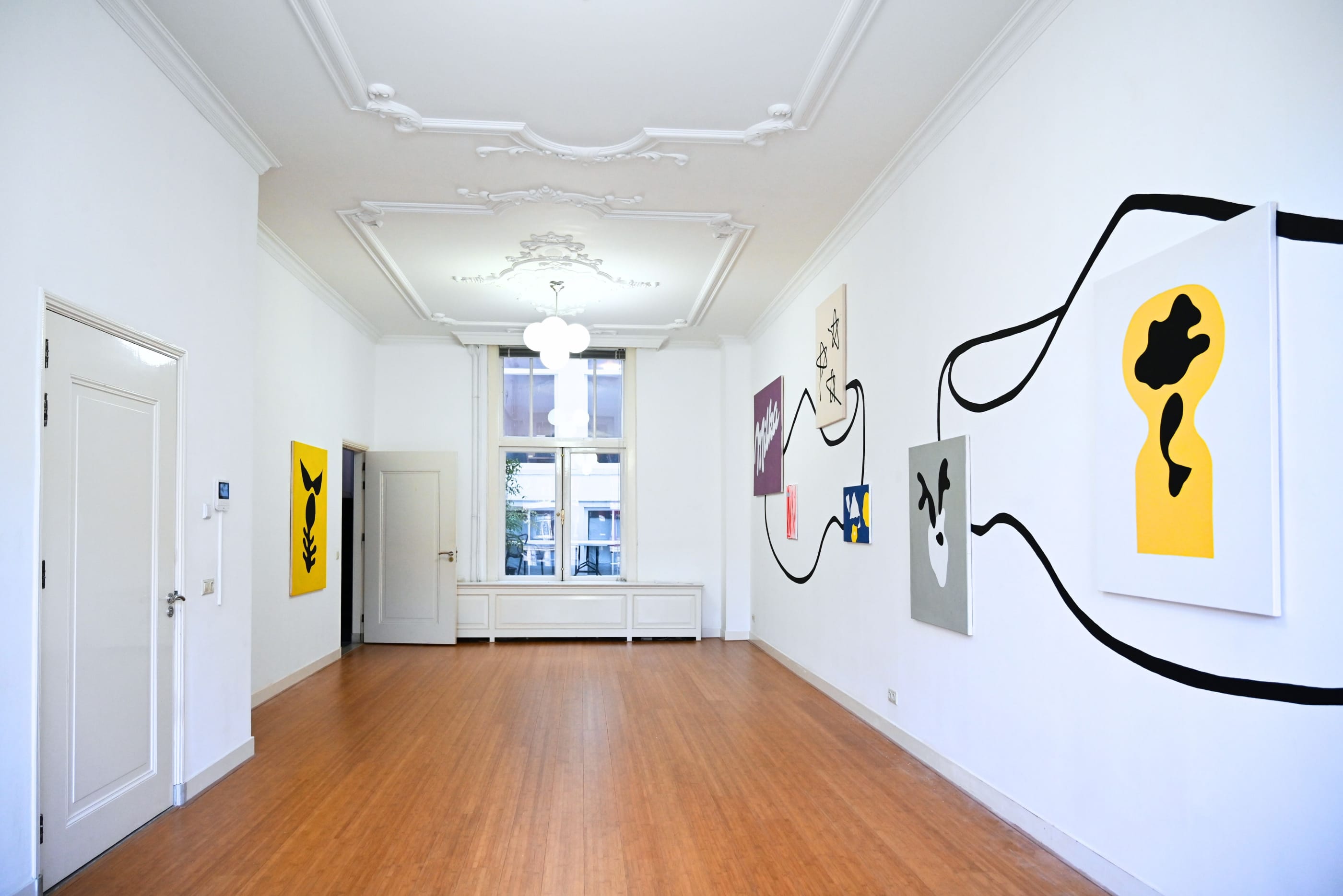
Camila Oliveira Fairclough, Zebra, 2023, Ellen de Bruijne Projects
Planting Her “Grand Pied” in Amsterdam
As this is her first exhibition at Ellen de Bruijne Projects, Camila wanted to make a strong visual statement. The gallery also features a large mural of a pair of clogs. “I wanted to plant my ‘Grand Pied’, my big foot in the gallery!” she laughs.
Her exhibition at Ellen de Bruijne Projects is not just a presentation of paintings but a lively interplay of images, words and ideas, where art history and pop culture meet in an universal language.
