09 january 2026, Martine Bontjes
The studio of... Pieter jan Martyn
What do you do when painting becomes temporarily impossible? During a period of mourning and grief the Belgian artist Pieter jan Martyn began to organise his old family archive and wrote letters to himself. Ordering his memories and feelings offered a sense of hold. It led to two projects in which anxiety, absence and memory take centre stage. Martyn’s paintings will be on view from 10 January at Frank Taal Galerie in Rotterdam. They are presented in the duo exhibition "Cythera" together with work by Marilou Van Lierop.
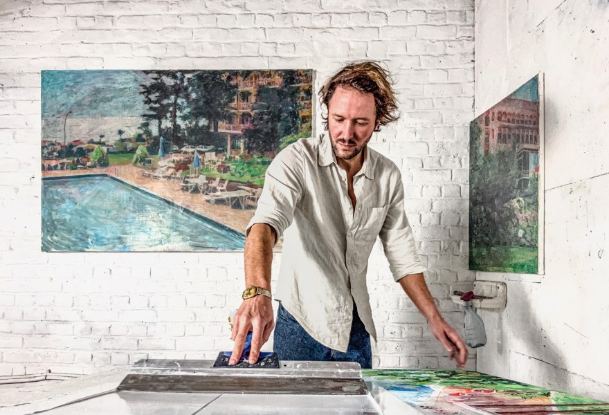
In his paintings, his work as a graphic designer and as a painter flow together. Martyn translates digital thinking in layers and corrections onto the canvas: “The thing I have always missed most in painting is the Command Z function. That small digital miracle that allows you to turn back the clock.” Martyn developed a technique that allows him to take a step back in time. Layer by layer he builds his images, only to partially slide them away again.
Where is your studio and how would you describe this place?
My studio is at home on the top floor of an old townhouse. The open roof structure creates a great sense of height and light. It feels like an extension of my living space but without distracting functions. Canvases can remain where they are dry and evolve. That gives both calm and continuity.
I read that as a child you already spent time in the studio of your father Hervé Martijn. What do you remember of that place?
As a child I had little affinity with youth movements or sports clubs. At weekends I would be at the academy or in my father’s studio. I loved the abundance of materials and the freedom to experiment with them. That shaped my way of working with material as an invitation and an experiment rather than a limitation.
Pieter jan Martyn, Never speak a word again | after image, 2025, Frank Taal Galerie
You stopped painting for a while. When did you start to feel that there was room for creation again?
Last year I was in the middle of a divorce and I quite literally ended up living in my studio for a while. No matter how many hours I spent there painting did not work. At night I was afraid to sleep because I feared the silence. That same year my grandmother whom I was very close to passed away. To avoid the silence I began at night to archive her family collection and would lie in bed for hours looking at slides. That act of archiving offered hold but also sharpened the sense of loneliness. Painting as I was used to doing, with clearly defined historical or political series still did not work. I picked up the paint again out of necessity first to confront my fear later to give emotions a place. From that two parallel projects grew. The first is “Mijn zomer met Streuvels” for which I created a pseudo realistic reality within which I wrote letters to frame my anxieties. Alongside this I started “Afterimage” in which I paint vistas from my grandmother’s slides without the posing holidaymaker making absence explicit. Only once the Streuvels project was completed and the calm returned, I could truly work out Afterimage in paint. Both series are not a return to how I painted before. They represent another way of working as a purification born of necessity.
Pieter jan Martyn, I will crawl away for good II, 2025, Frank Taal Galerie
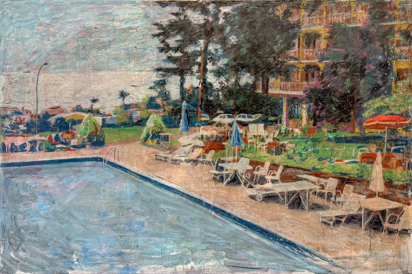
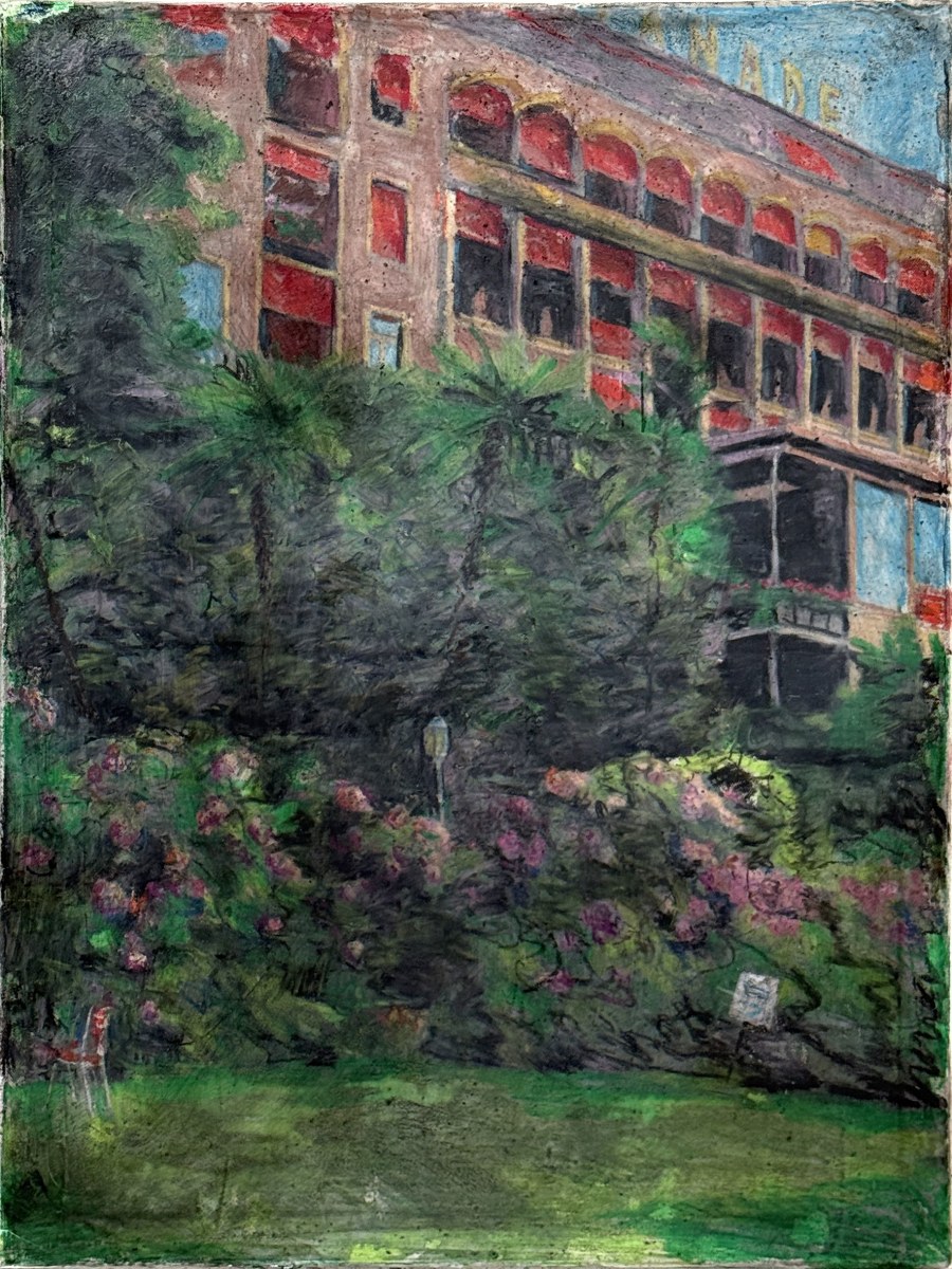
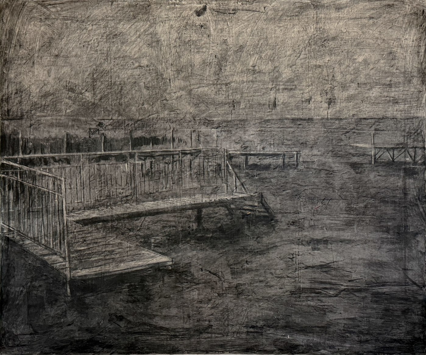
What does the title Afterimage refer to?
“Afterimage” is my working title. At Frank Taal my work is shown together with that of Marilou Van Lierop under the shared title “Cythera” a nod to Watteau and the romantic idea of escape into the landscape. I started from holiday slides of my grandparents which I endlessly viewed at night in my studio. I removed the posing figures but kept the original framing. This resulted in empty landscapes and architectural scenes such as deserted terraces beaches hotel gardens swimming pools constructed idylls without bodies. What remains are vistas with an uncanny vacuum framings that still evoke the absent presence for which they were once intended. “Afterimage” refers to the trace that remains once the visible has disappeared. All titles are fragments from "You Know You’re Right" by Nirvana. That song captures my divorce for me: broken communication, with two voices speaking next to each other rather than to each other. One keeps going, convinced of being right, while the other gives way to avoid conflict. The titles are deliberately simple fragments of the lyrics because the image needed to speak for itself without the added weight of an explanatory title. Together titles and paintings form a single whole two monologues side by side images that seem to await someone while only the afterimage keeps speaking.
The exhibition also includes works from your Streuvels project. How did that project start?
I set up a fictional correspondence with writer Stijn Streuvels (1871-1969) and created staged paintings in which I place myself as his contemporary closely aligned with the real correspondence surrounding his boat trip with "’t Haantje". The project was exhibited in collaboration with Museum Streuvelshuis and the Letterenhuis in Streuvels’ former home and was accompanied by a publication. I combined authentic correspondence between my great grandparents and Streuvels with fictional elements which resulted in a pseudo accurate constructed fiction that rubs uncomfortably close to the past. In the letters I speak openly about anxiety, loss, doubt, and getting stuck in my artistic practice. The paintings refer back to Streuvels’ landscape photographs from that boat trip and to staged group scenes in which I added myself not to rewrite history but to show how image fiction and memory contaminate one another. “Mijn zomer met Streuvels” thus became a dialogue that never took place but paradoxically contains more truth than many real exchanges of letters. It is an attempt to create an intimate space in which I could speak about anxiety, loss, doubt and losing my way as an artist conversations I ostensibly conduct with Streuvels but ultimately mostly with myself.

Pieter jan Martyn, Op den uitkijk - Mijn zomer met Streuvels, 2025, Frank Taal Galerie
Do you think your experience with hypnosis led you to investigate yourself more as a subject?
As mentioned these recent series feel like a compulsion a personal artistic response to the need to face things and give them a place. Strangely they are also the first two autonomous series I have shown since my hypnosis project at Frank Taal in 2021 titled "The 12th monkey". That hypnosis focused on the subconscious undoubtedly opened something up. I do not see it as the cause, but it did lower the threshold, shifting my focus away from the purely historical dossier toward my own material. Perhaps that hypnosis series set more in motion than Frank and I had expected. In any case I do not believe in black and white cause and effect. As in life painting is a trajectory in which multiple actors together shape an evolution.
Can you tell us more about the different materials you use?
I never had a classical training as a painter. I began experimenting in my father’s studio with whatever was at hand: paint, charcoal and other typical materials but I also found motor oil, pitch glues and wax materials that would likely be considered unorthodox within academic painting. That bricolage shaped my way of working. I enjoy combining materials and their mutual reactions adhesions and oxidations. Today I mix oil paint and acrylic with my children’s wax, crayons, wood, glue, printmaking techniques and epoxy. Sometimes it feels as though I am drawing rather than painting. Alongside painting I work as a graphic designer and I am somewhat addicted to Photoshop. The thing I have always missed most in painting is the Command Z function. That small digital miracle that allows you to turn back the clock. I sought a painterly translation for that. I work in thin semi-transparent layers which I fix each time. With sandpaper I can, if needed, go back to an earlier stage. That physical rewinding is never as smooth as in the digital world: traces remain, transparent layers can turn opaque, and shapes may shift or disappear. Yet it is precisely that repetitive trial and error process that gives my surfaces their sanded almost burnished appearance and allows underlying layers to continue to shimmer through opaquely.

Pieter jan Martyn, I will never promise III | after image, 2025, Frank Taal Galerie
You state that in your polychrome works, colour functions more as a veil. Is there a colour that symbolises mourning or loss?
For me colour does not aim to make the image more realistic or visually persuasive. It steers the feeling I have with the image or want to convey. I experience colour primarily as a carrier of memory. A certain ochre reminds me of the interior walls of my grandmother’s veranda, and a faded blue and purple of her floral sofa by the sea. They are not symbols I deliberately choose, but echoes that emerge while I work. Colour does not function as a code but as a layer that gives the image a certain value for me, a veil that does not explain but touches.
The year has just begun. What is on the horizon for you?
Recently I have been discussing with a befriended artist two possible new trajectories we might develop together. Whether I am ready for them and whether they will even lead to a result as before remains to be seen. One series currently carries the working title "The Man on the High Cupboard" and is again personal. It connects in a certain way to the hypnosis series and to the idea that certain thematic choices in my earlier work may have emerged from an unconscious consensus. The other possible series stems from my fascination and at the same time my dissociation with the Catholic faith. More specifically it concerns a curiosity about early medieval side currents within the European Catholic tradition and how they influenced the later church system. When and in what form these series will evolve is at this moment an even greater mystery than the point of departure itself.
Pieter jan Martyn, I will never bother you | After image, 2025, Frank Taal Galerie
