21 april 2026, Martine Bontjes
The studio of... Esmee Seebregts
Over the past months, Esmee Seebregts has been preparing her solo exhibition Colour doesn’t hurt at Studio Seine at her colour laboratory in Arnhem South. Seebregts investigates the meaning of colour, a research that is not only material but also theoretical. Inspired by, among others, David Batchelor and Aristotle, she questions the persistent Western notion that regards colour as subordinate, as something fleeting, emotional and therefore less truthful. In her work, Seebregts uses colour as a critical lens to reveal cultural prejudices.
This becomes evident in her series Embarrassments and Joseph’s Dreamcoat. In the latter, Seebregts refers to the Biblical story of Joseph, in which his multicoloured coat provokes jealousy and violence. It is a powerful metaphor that illustrates how abundance remains subject to suspicion. “Perhaps the most meaningful insight is that colour can teach us something about ourselves.”
Next week her work will be on view at the KunstRAI in Amsterdam, where she will present her work together with Lise Sore in booth 97 from 22 to 26 April. The exhibition Colour doesn’t hurt remains on view at Studio Seine until 30 May.
Where is your studio and how would you describe this place?
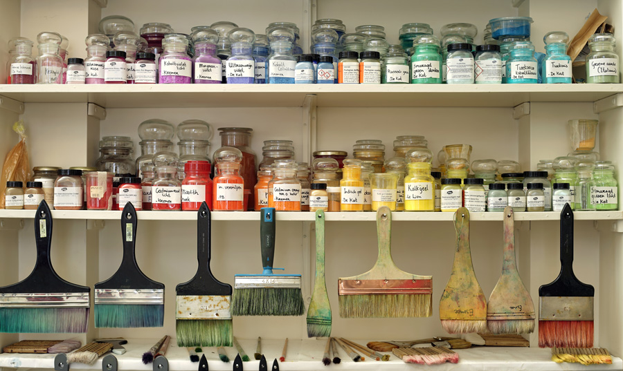
My studio is located in Arnhem South in a building shared with many other artists from Arnhem. It is one large open space with different corners, each serving its own function, such as an area for preparing my paint. This is also where I keep my extensive collection of pigments and binders, a wall for my brushes, a cabinet filled with materials and tools, and a section for storing my work. In the centre stand long worktables where I paint and some sculptures hang on the ceiling.
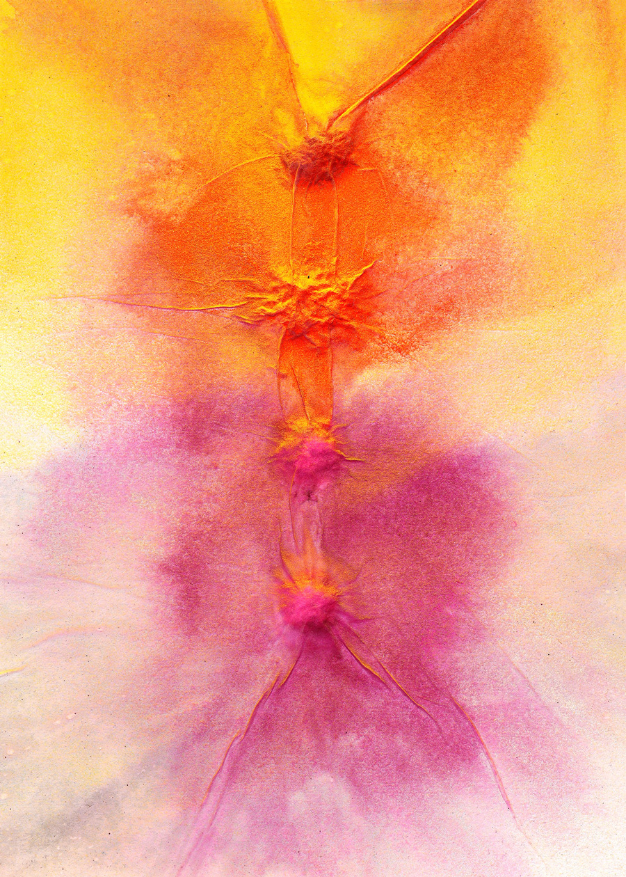
Esmee Seebregts, Embarrassments II, 2025, casein and silk paper on holographic paper, 18,5 x 26 cm, Studio Seine
Is the studio you have now your dream studio, or do you still long for another kind of space?
My ideal studio would be more spacious and have more daylight than the one I work in now. I also dream of a studio divided into two separate areas, a well equipped wood workshop where I can saw and sand since I make all my panels myself, and a separate space for painting. At the moment I saw outside so that no sawdust or sanding dust enters my paintings. This is logistically inconvenient because I have to carry my machines outside each time.
What does a typical weekday in your studio look like, do you have certain routines? What have you been working on this week?
I like to alternate preparatory tasks such as priming panels and grinding paint with the actual act of making such as painting. In recent months I have also been creating spatial ceramic work. This time spent on preparation is valuable because it allows me to keep working with my hands, these are meditative actions that often lead to new inspiration.
Your work revolves entirely around colour, you conducted research into its meaning, how did you approach this and which insights surprised you most?
Colour has taught me to look at the way we assess and organise our sensory experiences, at our often unspoken habits of thought, preferences and cultural biases. That last aspect was a surprising insight for me and has had a major influence on my practice. This became clear after reading the book Chromophobia by David Batchelor. He describes how colour has been marginalised in the West since antiquity and dismissed as inferior. This began with Aristotle, who in his book Poetics introduced the opposition between line and colour in painting. Line was associated with clarity, reason, truth and the masculine, while colour was associated with changeability and therefore seen as less truthful, with the emotional, the superficial and the feminine. Within this seemingly harmless opposition between line and colour lie many other contrasts that are far from innocent. This is evident, for example, in a passage by the French art theorist Charles Blanc from 1860: “The union of line and colour is necessary in painting, just as the union of man and woman is necessary to produce humanity, but line must retain its dominance over colour. Otherwise painting will rush toward its ruin, it will fall through colour just as humanity fell through Eve.” Perhaps the most meaningful insight is that colour can teach us something about ourselves.
You make your own egg tempera paint, what do you need for that, what fills your studio?
I make my paint from pigments and eggs. The binder consists of egg yolks, water and a small amount of vinegar, which I grind together with the pigments into paint using a glass muller on a marble slab. Because this paint has a limited shelf life of about a month, I store it in a small refrigerator in my studio.
You say you want to give colour a form through matter, what exactly do you mean by that?
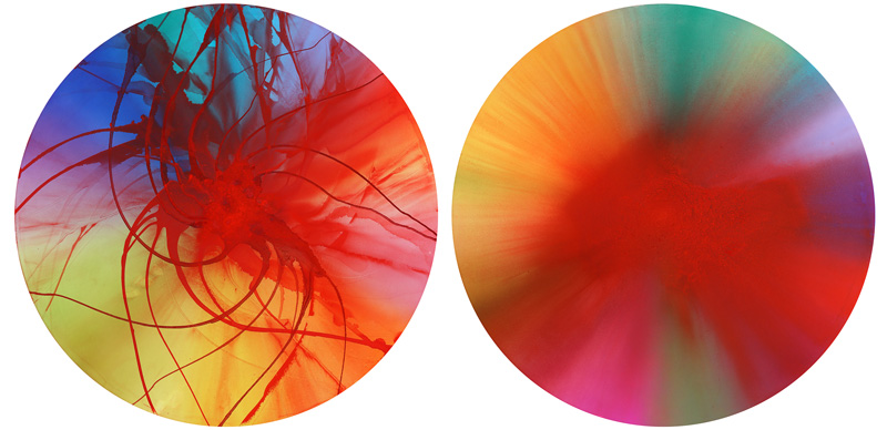
Colours exist by virtue of light and are therefore just as intangible and immaterial, even though we see them on everyday objects we can touch. When I think about the essence of a colour and try to paint it, the first question I encounter is in what form. At times it feels as though I am giving a body to colour. I try to find a form in which a colour manifests itself most fully. As Rudolf Steiner once said, “Colour is never truly real but always an image of something.” But does every colour have such a form, a body in which it appears most clearly, and how does that form influence our perception of colour. These questions occupied me especially while creating my Origins series - Origin of Orange from 2021 in the Noordbrabants Museum in ’s Hertogenbosch.
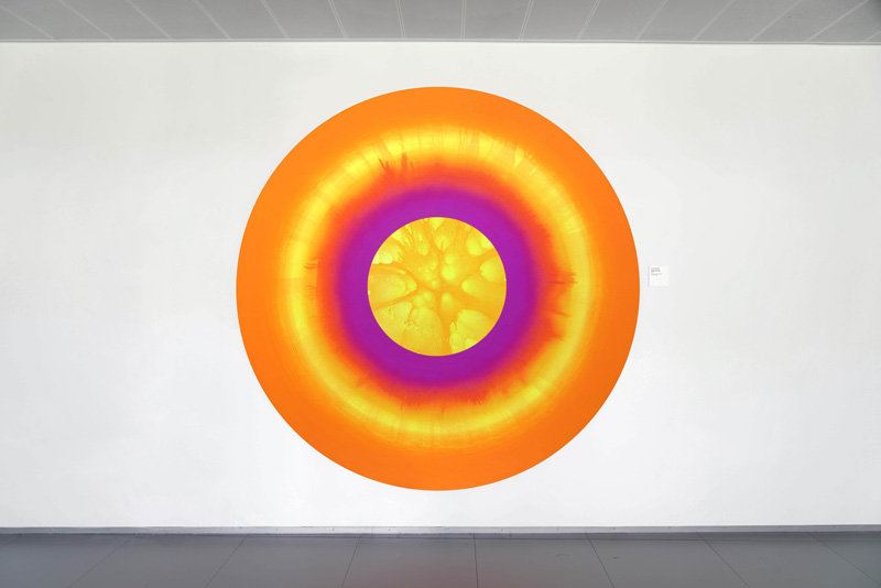
Esmee Seebregts, Origin of Orange, 2021, egg tempera and spraypaint on wood, 205 cm Ø
Are there colours that are more difficult to make or control than others?
Each colour has its own character. One is not more difficult than another. Sometimes I understand better how to work with a particular colour at a given moment, but that says more about me at that moment than about the colour.
Your panels require a long preparation, partly due to the layers of your surface, how long do you usually work on a piece?
Indeed my working process is quite labour intensive. I saw my panels myself and then apply eight layers of self made gesso suitable for egg tempera. I rarely work on just one painting, rather I move like a kind of butterfly between different works, touching each one briefly before letting it go again. My paintings are built up from many transparent layers, which require time and attention. When I use the pouring technique, drying times are also long. I often spend weeks, sometimes even months, on a work, although this does not mean I work on a single panel continuously. Sometimes a work is left to rest until I know how to proceed.
What do your works with the titles Vjosa, Croc and Joseph’s Dreamcoat refer to?
Vjosa refers to the last major wild river in Europe, flowing freely and winding through southern Albania without dams or canalisation. Croc refers to the crocodile like paint surface of this paper work. The series of round paintings titled Joseph’s Dreamcoat is inspired by the Biblical story of Joseph who receives a multicoloured coat from his father. This brightly coloured garment symbolises his favoured position within the family. His brothers get jealous and hate him. Eventually they sell Joseph into slavery and use his coat to deceive their father, smearing it with blood and pretending Joseph has been killed by a wild animal. It is a Biblical tale of jealousy and envy. What fascinates me in this story is that the colourful coat is apparently too much, it is the final drop that causes everything to overflow. I see in this a parallel with the Western view of colour today, abundance and intensity still evoke negative associations, influenced by a Christian morality of humility and restraint.
Esmee Seebregts, Josephs Dreamcoat IV & V, 2024, ei-tempera op paneel, 103 cm Ø
In your series Embarrassments the colours lilac, pink and orange recur repeatedly, why do you use these colours??
This series contains references to physicality and sensuality, which is why I arrived at this palette. These colours are also more readily perceived as feminine, which suits the theme of the works.
Do you have a favourite colour to work with, or a colour that continues to challenge you?
obalt violet light is currently my favourite colour, it is an extraordinary combination between magenta and purple, incredibly radiant. I once travelled to Florence to obtain three kilos of this pigment because it had been discontinued by Kremer in Germany, where I usually buy my pigments. I continue to have a difficult relationship with black and rarely use it. When I want darker tones I choose indigo, purple, Prussian blue or Russian green.
Will your research into colour ever be finished? What are you working on now?
My research into colour began from a sensory and almost metaphysical perspective but gradually shifted toward a focus on the cultural meaning of colour. That shift continually opens new fields of inquiry. Colour increasingly functions for me as a mirror through which to look at ourselves, at humanity. At present I am exploring complex social emotions such as shame and guilt and the colour associations connected to them. In this research I inevitably encounter themes such as religion, symbolism and cultural prejudice.
