05 november 2024, Flor Linckens
Eva Dijkstra: the visual poetry of data
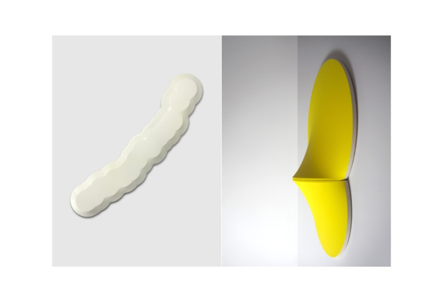
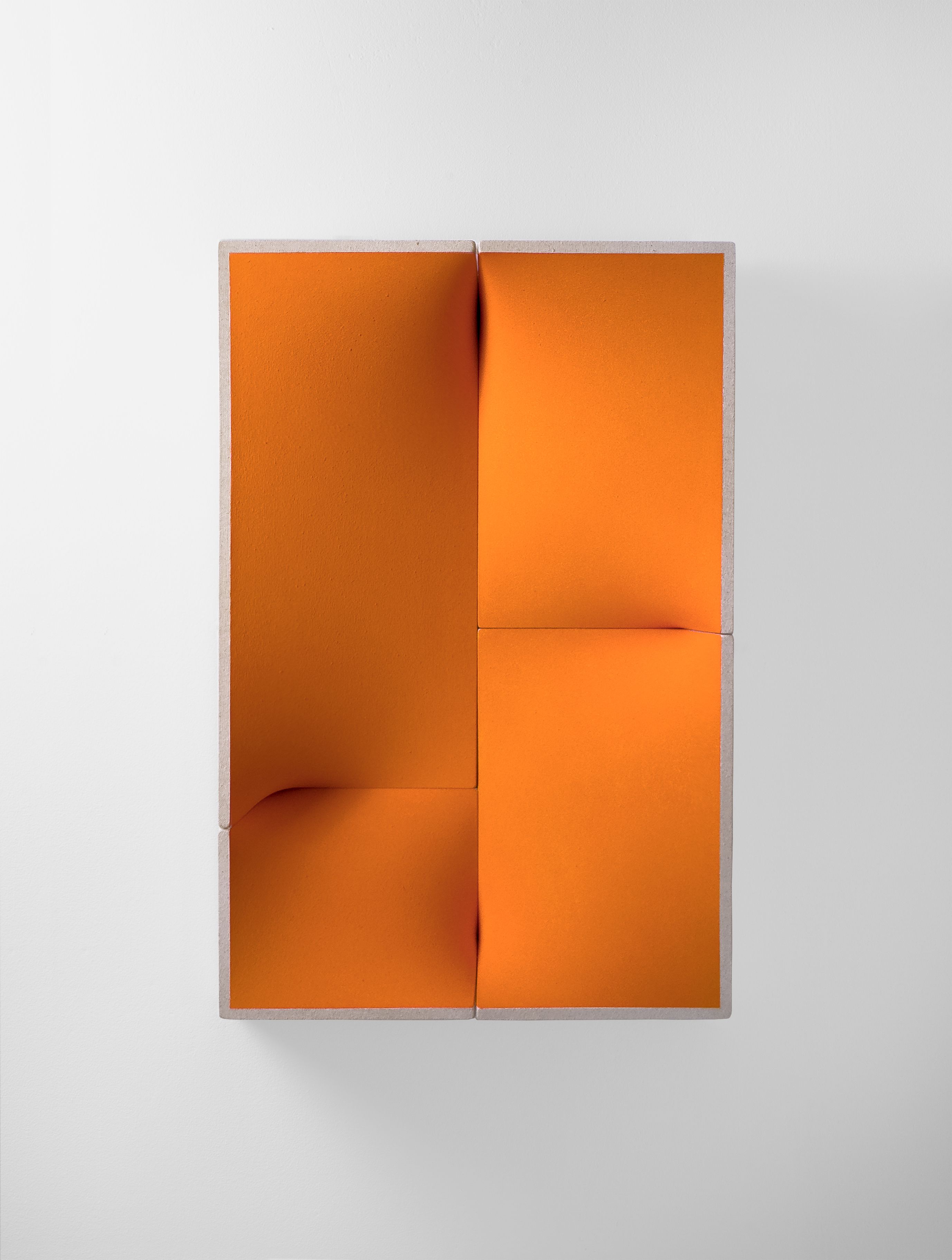
Eva Dijkstra is known for her artistic practice in which minimalism, abstraction and data converge in intriguing ways. Through data visualisation, Dijkstra creates works that are both abstract and conceptually layered. Her objects are defined by geometric, clean forms and monochrome colours, yet they also speak to the world we live in. The forms evoke diagrams and data on subjects such as projected population growth (1999–2100), our ecological footprint, urbanisation, the World Happiness Index, rising temperatures and even the physical distance between continents.
Dijkstra translates these abstract numbers into precise diagrams, which she subsequently transforms into visual compositions on canvas. Each piece carries a hidden story that only reveals itself upon closer inspection — sometimes hinted at in the title or on the back of the work. These ‘hidden narratives’ imbue her art with a layered quality, where art and science intersect. Until 16 November, her work is on view at Galerie Helder in a duo exhibition with René Korten.
Dijkstra: “A distinctive feature of my work is the second layer reveal. Each piece finds its origins in data, a hidden narrative beneath the surface waiting to be unveiled. I meticulously dissect and translate ‘found’ numbers into precisely crafted diagrams, forming the foundation of my compositions. This process transforms raw data into visual poetry, merging analytical rigour with artistic expression.”
By visually deconstructing and reordering data, Dijkstra explores how art can help us approach data as a layered, sometimes elusive reality that doesn’t always lend itself to simple conclusions. The shapes and abstract colour fields prompt questions about the role of data in our everyday lives. With analytical precision, Dijkstra examines statistics and how they shape our understanding of the world. Her yellow piece, "Pristine", currently on view at Galerie Helder, visualises, for instance, the fact that 77% of the Earth's surface (excluding Antarctica) has been altered by human activity.
During the pandemic, Dijkstra created a work displaying a series of (cor)related data points: COVID-19 cases +971%, Toilet paper sales +60%, Unemployment USA +26%, Gold price -12%, AUD to Euro -15%, Dow Jones Industrial Average -30%, Air pollution -50%, WTI crude oil price -57%, Commercial flights -65%.
For other works, she visualised consumption patterns, illustrating that if everyone worldwide consumed like the average (US) American, we would need five planets to sustain that lifestyle. Even European consumption requires at least three Earths. By focusing on consumption rather than production, she presents a more realistic picture; China’s production volume is often emphasised, while much of that output is consumed in the West. In earlier works, Dijkstra analysed the (cor)relation between wealth and happiness in countries like Mexico, Brazil, China, Greece and the United Arab Emirates.

A graph, in itself, is already a rather abstract way of representing data. While numbers are often seen as factual and unchanging, a certain degree of abstraction and potential manipulation is always inherent in figures and charts. Statistics can be adapted to support specific perspectives or can paint an incomplete picture of complex realities. One could manipulate the scale on the horizontal or vertical axis or selectively show certain data: what do you include, and what do you omit, and why? A correlation, moreover, indicates a statistical link between two variables, while a relationship can also imply causation, where one variable affects the other. That way, Dijkstra’s work touches — intentionally or not — on an intriguing tension between objective data and the subjective power of interpretation.
Dijkstra’s work offers a fascinating glimpse into the interplay between minimalism, data and abstraction. Her geometric objects are carefully constructed from MDF, with tightly stretched canvas overlaid and then coloured with acrylic paint and pigments. It’s a labour-intensive process, in which she lets the two-dimensional canvas spill into three-dimensional space, positioning her work on the boundary between painting and sculpture. Sometimes, her pieces appear to be powered by electricity, seeming almost to emit light, though this is not the case.

Dijkstra was born in the Netherlands in 1974 and lived in Australia for fifteen years. She studied at the St. Joost School of Art & Design in Breda, followed by a career in which both art and design play a significant role. She is co-founder and creative director of the design agency ‘Design by Toko,’ with clients such as the Australian Institute of Architects, the city of Sydney, and the Danish Agency for Culture. In 2012, she co-curated and designed the Australian Pavilion at the Venice Architecture Biennale Exhibition.
Recently, her work was part of the group exhibition ‘MINIM.AL’ at Museum Icoon in Hoek van Holland, alongside artists such as Anne Truitt. A few weeks ago, Dijkstra unveiled her first permanent public artwork in Sydney for the Returning Services League (RSL), an Australian organisation dedicated to veterans and their families, with a history dating back to after the First World War. Visually, the work references the ribbons of Australian military honours.
